Blurry LinkedIn Background
Normally I only post when I have a fix for something, however this time unfortunately I don’t. What I am recommending people do is share this post! If you have Twitter, please click the tweet below so that Linkedin is specifically mentioned.
Update 2022: A few users have mentioned that these dimensions work pretty good: 4355px by 764px
Please fix the blurry background image on profiles @LinkedInClick to PostThis blurry problem has been an issue since June 2014!
What is the problem?
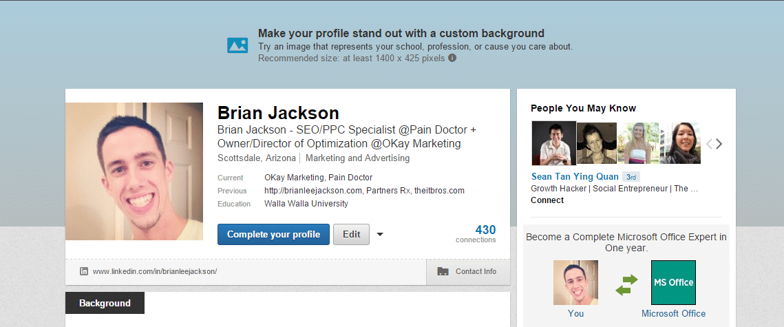
The issue here is that LinkedIn released these new background images back in early summer of 2014. As you can see below it recommends I upload an image at 1584 x 396 pixels. And it must be under 8 MB (source). So I tried that and ya let’s just say it turned out horrible.
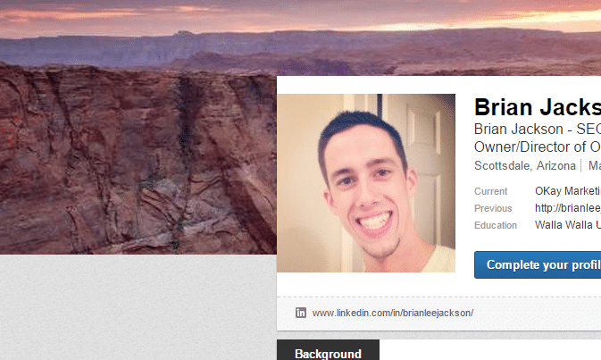
Even after following other people’s recommendations such as this one: New LinkedIn Premium Profile Redesign with Background Image and uploading a high-resolution image at 2800 x 814 pixels it still turns out blurry. See below, you can tell in the mountains and sunset areas the horrible pixelation.
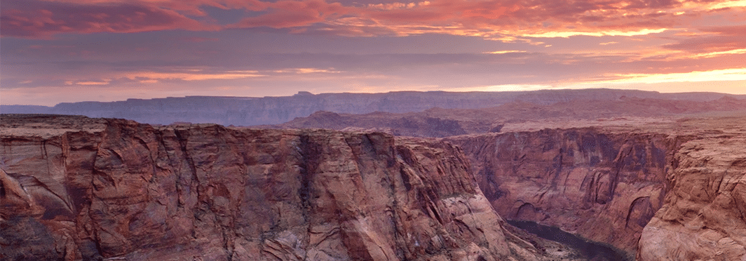
Here is that same image… or rather how it should look.
Don’t even think about uploading anything with text in it. At this point your best option is to use the blur tool in Photoshop and go for that effect on purpose.
Reader Example
Eithe was kind enough to post an image with text in it so you can see how that looks. Here is his original photo.
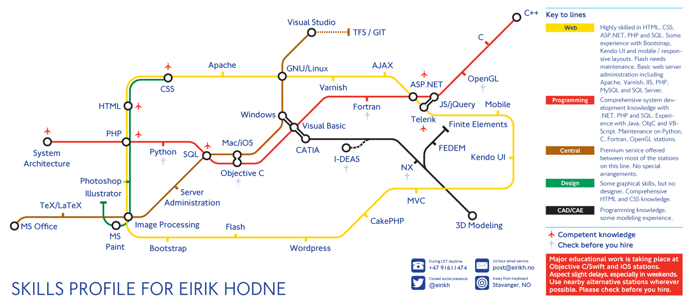
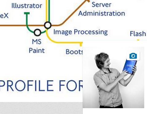
And here is how part of it looks on LinkedIn. The compression/pixelation around the text is horrendous.
Why release this feature if we can’t make our backgrounds look decent?

@brianleejackson @tomzur Don’t worry, the team is aware and will hopefully have it taken care of in the not so distant future :) -DH – @linkedinhelp (source)
Update 05.14.20: This is still apparently happening for some people six years later.
As always let me know what you think below in the comments. And please share this article so that LinkedIn will finally get around to fixing this. Or post in the LinkedIn thread above.
Looks like they finally fixed it… My account shows great looking pics now.
This is still an issue.
I’m still having issues. Every photo I try to upload turns out blurry, regardless of the fact that they meet all the requirements LinkedIn suggests. Very frustrated with this right now.
Ya, I don’t think they will ever fix this. It has been a problem since 2014.
Why is it that I see other banners that are crisp looking though? For example, Harvard Business Review’s banner is very crisp. Do these accounts have special privileges or are they doing something to achieve this look?
Unfortunately, this is not fixed yet.
I create exemplary LinkedIn profile images and banners for my clients and use all the correct aspect ratios and resolutions. A few of them have informed me about the blur on LinkedIn. I then re-edited the images at a much higher resolution and signed into my client’s profile with permission from him and uploaded the images myself. There was a slight improvement since the images were at a higher resolution, but once uploaded to LinkedIn the images still blur. This is highly frustrating.
I hope LinkedIn will fix this blurry issue soon!
I have the same issue. Till this day it isn’t fixed.
Still, they can’t fix it… I face the same issue on 11 January 2023.
The article has been updated April 2016 – what’s the news?
As of now, June 2016, I can’t upload a background image in high resolution without it looking blurry. Is it something to do with having a basic or premium account?
Unfortunately this is still a problem in 2017. There is no way to fix it.
I’m still annoyed with this. The LinkedIn thread has now disappeared as well.
Ya I pretty much gave up on this… LinkedIn has definitely shown they don’t care what we think :(
Hmmm So, this is still not fixed in 2017, despite promises. I believe the problem is in LinkedIn’s CSS. Regardless of the size I update, the CSS is rewriting it to enlarge it. 1440×477 rewrites to 1440×490.625. Every time I try, it’s getting upsampled and cropped. Thus, the blurriness, I believe. I’m sure it’s also getting lossy compressed somehow too.
It’s actually their .freemium-bg-image {width: 100%;} from what I can tell. To avoid that, they should tell us a more accurate width. I think they’re doing that to be responsive to many screen sizes, but it doesn’t work well in the real world, especially since they’re compressing the images first.
I’ve been wrestling with this. I read one post which recommended 1536x438px. Then in seeking to upload that I saw the recommendation (dropdown) from LinkedIn of 1536×768 (only 36.5kb). I tried that, and got the blurry effect. Then that updated pic disappeared, leaving the old one there. Same result after a few tries. In the circumstances, good advice to not include text in the image – or, on my experience now, a logo.
Hey Des! Ya unfortunately there is not a good solution yet. But definitely keeping text out of the image helps kind of fake a better looking picture :)
I have fiddled with this for half my day today! I have been including logo & short text in my social media covers and today I noticed that if I used LinkedIn’s recommended dimensions (1536×768) it actually SKEWS the image, making my text/logo squished short. What kind of reputable site does this?? Not cool. Anyway, I inspected the image area & found that 1536×596 is a much more accurate dimension. Proportions look great but sadly the photo is STILL BLURRY. Very obvious on text & logos, or anything with clean crisp lines. But at least it’s not being skewed. So awful & super frustrating when the site deliberately gives inaccurate dimensions.
Ya, it is super frustrating. Not sure what is wrong with LinkedIn developers. It has been 3 years since I originally wrote this article. I have given up hope for them fixing it.
Sort it out Linkedin! This issue has gone on for years!
How can you present yourself professionally if your timeline image looks pixelated and crap!! This should be priority number 1!
Thanks so much for posting this so I know I’m not crazy!
Well I landed in the right spot. I could not for the life of me figure out what I was doing wrong for a banner image I was making for a client. High quality, “correct” dimensions, png and it’s still blurry. Not only that but they put a shaded gradient over it. It’s the worst! Unfortunately I did include text in my client’s banner, including their logo. I don’t really have other graphics or photos to work with in keeping with his brand. I’ve looked at so many banners, including social media experts’, and they all suck. So there it is.
Hi All,
I’ve read all I could find on the Internet, and this is the only thread that concerns about header LI image appears blurry.
Any updates?
I have an example on one profile where that header image looks crisp, so it is possible!
Not yet fixed as of May, 2020.
Not yet fixed as of March, 2021
Yup, still an issue. I’ve monkeyed with the size, resolution, color complexity, file type, everything. Still results in a fuzzy image.
Some accounts have perfect images. Whats up with that?
Do some accounts have crisp background images because they are paying for premium LinkedIn?
Is a crisp background image a Premium feature? 🤷🏻♂️
I am also dealing with this issue. 5/27/2020.
SAME. PURE CRAP. Maybe it is only for premium members.
Nope. I have premium. Still awful.
its crisp on mobile now, not desktop tho
Just tried premium now and my image got much better than before. I made the banner in illustrator and exported it really close to the upload limit (8mb). The ppi is 500, probably overkill but wanted to make sure.
Wow! You cracked the code. I’ve been struggling with this for days. And DAYS.
Is your uploaded file a png or jpeg or…
Did you make yours in illustrator because it’s vector?
What are its dimensions?
I still haven’t solved this, either exporting as JPG or PNG, and at 4x resolution (6336 x 1584)… it still looks blurry. Pulling out my hair…
I found a solution for myself (regular account).
I uploaded the cover, and it was sharp. Then I decided to adjust it a bit, and it turned out blurry. I thought I was going crazy. I tried adjusting and adjusting, and no improvement.
I ended up deleting the cover and uploading same image again, and now it is again crisp and clear! Try it.
Still not working. Tried every single thing. I’ve done a similiar skills map as the guy (the metro map) and Even coming from Illustrator which gives me options to rescale, compress, and export for website, I can’t find any way to show it decent.
My recommendation is: Try different fonts and use the recommended pixel size. Export with Illustrator (Export for web) and enable the text optimization.
Hope they fix it properly.
PS: in the phone version everything looks better!
Hey all,
Came across this thread today and (just as frustrated as you all), have been wondering about this for all the years I’ve been on LinkedIn. I can confirm for myself the above try works:
1. I used Illustrator with artboard at the exact dimensions recommended by LinkedIn
2. For my image, I used a combination of imagery and vector art
3. I saved (exported) from Illustrator as .png in original size with artboard sizing
4. I deleted the old blurry image entirely from my profile, saved the change
5. I uploaded the new .png (which was saved at 300dpi, resulting in a file that was 6.2 MB in size.
6. Worked perfectly — crisp profile image.
This is still an issue December 1st 2020.
I have tried using 300 dpi instead of 72dpi and followed all instructions from linkedin.
The text still comes out blurry. It is super unprofessional for a “professional network” to render images with text useless. As a digital agency we would not want to represent ourselves with a blurry photo.
I’ll definitely share this article @linkedin ..
Come on LinkedIn, it’s almost 2021, storage is cheap, stop compressing our background images to dust!
I’m glad I found this page. At least now I know for sure I can stop trying, and stop wasting my time. I’ve tried everything possible. Looks as blurry as dead…. sad, it sucks so bad
Aaaaarrrggghhh … same for me. Have tried EVERYTHING. For years. Beyond frustrated. Outside LI the image is sharp and clear. Once uploaded to LI the image is a soft blurry embarrassment. And my client has a text based logo! Nothing I can do about that. All this effort to create a LI profile and then the first thing people see is a mushy banner. Something I noticed … this blurry image thing is happening on my client’s personal page but on their company page, same banner image displays much more sharply. Can this get any weirder? Come on LinkedIn, do us all a favor … pretty please!
Still a problem in Sept. 2021. . . Tried to resize image with Illustrator and Photoshop but no luck.
Okay so it’s Sept 2021 and Yes, stop hoping this issue will resolve. :D :D
Damn LinkedIn.
The logo of my site has a red background and white letters. However, when uploading this to LinkedIn, it’s totally blurred. I’ve changed to dark blue now, and now it doesn’t seems blurry at all.
So I guess it has to do something with certain combination of colors. I hope this can help you.
STILL an issue in late 2021 guys!!!
It feels amazing to know that I am not crazy! January 2022, still an issue. I have submitted a ticket and hopefully, it will be addressed soon.
Working Solution:
(for both background and profile pictures)
Background picture fix: By inspecting the background image with your browser, you can see linkedIn adds some useless CSS to the image, they add these to resize and positioning.
They add and hence force:
width: 1128px;
and
height: 284px;
Solution: Provide your image with exactly these size (1128*284). It will be sharp as it supposed to be. (export 72dpi).
Profile picture fix:
When you upload your profile picture, linkedIn resizes your image to 200*200, then they add and force 112*112 by CSS. (Hell knows why… -.-‘)
Solution: Upload your profile image as 200*200 (72dpi). It will be sharp.
That’s it :)
Sure, buy my image is larger, proportionately so should scale down just fine. I am using the 1594×396 that they say to use. dpi is at 300. The image is literally color boxes and text. Linkedin is absurd for not fixing this issue for so many YEARS! Rant over, have you uploaded at their size and it is blurry and then used your size and it worked? Thank you in advance!!!
Used a picture with the size 1128×284 and 72 dpi today and it‘s still blurry :/
Worked for me. Thanks.
1128*284
Fixed it!
I screenshotted the LinkedIn profile image and opened it in photoshop. Then, using rulers, I sized the artboard accordingly. I also quadrupled the size of LinkedIn’s suggested dimensions. The dimensions I used are 4355 px by 764 px. So yay, no more blurry photos. It’s not perfectly crisp like I want it to be, but at least it won’t make it look completely pixilated. Oh, keep in mind Linkedin crops your image slightly at the top.
More info: Initially I tried doubling the size of LinkedIn’s suggested background image size. That didn’t work. I also tried opening it on Canvas and Adobe Illustrator. I think any app would work for this as long as you have the correct dimensions. I think everyone with beautiful, crisp photos just uploads a large photo to LinkedIn and then lets LinkedIn crop it, that’s my theory. Linkedin suggests using 1128 x 191 pixels, the width is too long. I found that I cut off about 40px from the 1128px measurement.
And…if you are curious you can visit https://za.linkedin.com/company/syneru -that’s the link for the company I work for where I have applied these dimensions.
I hope it works for you!
TLDR: Use the dimensions 4355 px by 764px for your Linkedin Background.
Yes, 4355 px by 764px works
Not for me, unfortunately.
I think I figured it out.
I used the following size: 1128×191, and made the image from 57kb to 220kb, and now it looks crisp.
I tried it all and it seems crisp when I upload. But once I reload the page, it goes back to very low quality. Anyone found the solution?
No, have the same problem.. what is your pixel/ inch?
Doesn’t work for me with 1128 x 191 for the company page.
Fixed – create an image 3 to 4 times larger.
Example 3384 x 573 keep the dimensions that LinkedIn wants.
AMEN! Nailed it.
Can confirm… Use 3384 x 573 pixels – I set to 300dpi and 16bit for the craic.. exported as png… BOOM!
Same for me, is there a solution yet?
I think I may have a lead on the issue.
Most examples of the problem seem to feature the color red, I tried removing any saturation from my banner, and lo and behold, it’s gone/much less noticeable.
Sounds weird, but worked for me at least.