I’m a big fan of web performance. But I also don’t think it should or have to compromise design. There is always a good balance in the middle. Back in 2017, I was on GitHub’s blog and was digging their font. It was super easy to read. So I dug into the properties with Chrome Devtools and saw that they were using a system font stack.

I’ve been using system fonts for years now and love them. So today, I want to show you how to use a system font stack on your WordPress site.
What is a system font stack?
There are different types of fonts to choose from for a website. You pretty much have four different options:
- Web-safe fonts: Free and no download time required by the browser, but typically look dated and therefore aren’t used a lot. Nobody really likes Arial or Tahoma, do they? See a full list of web-safe fonts.
- Web fonts: Look beautiful, but require download by the browser. Have both free and premium options available. Adds to the overall page weight of your website. However, they can be served from cached CDN. Providers include Google, Adobe Fonts (TypeKit), etc.
- Host web fonts locally: Both free and premium options are available. It still requires download time and can take advantage of a single HTTP/2 connection on cached CDN. All major browsers now have separate cache partitioning, so hosting them locally is actually better for performance. You can host your Google fonts locally with Perfmatters.
- System fonts: Free, look pretty darn good as they match the OS, and no download time required! They are used by Weather.com, GitHub, Bootstrap, Medium, Ghost, Booking.com (read their system font story), PubMed, and even your WordPress dashboard. In my personal opinion system fonts look slightly better on macOS versus Windows.
System fonts are nothing new. In fact, Medium was using them in 2015. They feel just like your OS because they are using native fonts. Many modern operating systems choose fonts very wisely, and all have a very sleek look and feel to them. It’s not like defaulting back to a web-safe font of Arial or Times New Roman. Trust me; nobody wants to see Times New Roman on a website.
And best of all, system fonts work just like web-safe fonts, in that they don’t require any download time by the browser. This can help reduce the overall page weight on your website. As of April 2022, web fonts, on average, account for around 6.07% of a total website’s weight. While this is not huge, remember that every little optimization you make adds to a speedy website, especially on mobile.
Are there any disadvantages to using system fonts? No! That’s the beauty of it. Warnings in PageSpeed Insights like “Ensure text remains visible during font load” never even come into play, because technically there is nothing being downloaded.
System font stack CSS
With the font-family property with web fonts, you typically have your primary font and one or two fallback fonts. With system fonts, you have to include all of the different operating systems, and therefore you have to stack quite a few more fonts. This is why it is called a “system font stack.”
For example, here is how CSS might appear with a web font.
font-family: "Open Sans","Helvetica Neue",sans-serif;
And here is how a system font stack might look. The good news is, they aren’t all loading; it’s just an order of which fonts should load from the OS if they are available.
font-family: -apple-system, system-ui, BlinkMacSystemFont, "Segoe UI", Helvetica, Arial, sans-serif, "Apple Color Emoji", "Segoe UI Emoji", "Segoe UI Symbol"
Did you know your WordPress dashboard uses a system font stack? Here is what they are using.
font-family: -apple-system,BlinkMacSystemFont,"Segoe UI",Roboto,Oxygen-Sans,Ubuntu,Cantarell,"Helvetica Neue",sans-serif
CSS-Tricks also has an alternative method on how to apply system fonts using @font-face.
System font stack cheatsheet
This is where you have to choose which setup you want. Here is a list of which fonts go with each operating system. Note: This changes over time, so you might need to revisit your fonts as new operating systems emerge. I will make sure to keep this list updated.
| System Font | OS |
|---|---|
| -apple-system (San Francisco) | iOS Safari, macOS Safari, macOS Firefox |
| system-ui | macOS Chrome, Windows Chrome (new versions) |
| BlinkMacSystemFont (San Francisco) | macOS Chrome |
| Segoe UI | Windows Vista and newer |
| Tahoma | Windows XP |
| Roboto | Android, Chrome OS |
| Oxygen / Oxygen-Sans | KDE |
| Fira Sans | Firefox OS |
| Droid Sans | Android (old versions) |
| Ubuntu | Ubuntu |
| Cantarell | GNOME |
| Helvetica Neue | macOS versions < 10.11 |
| Arial | All |
| sans-serif | All |
How to implement a system font stack
I use a system font stack here on woorkup.com, and on all of my other websites. I feel like I have finally found the best of both worlds. And here’s how I did it.
Option 1: Use the GeneratePress WordPress theme
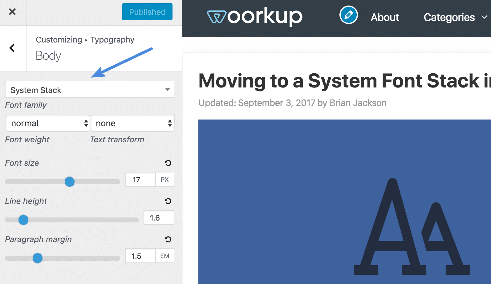
Want to make this super easy? Just move to the GeneratePress theme, which is what I use on all of my websites. In the customizer, under Typography, you can simply select “System Stack.” And that’s it!

Other performance-focused themes like Astra also have the option to use system fonts.
Option 2: Add system font stack with CSS
If you’re using another WordPress theme, you can easily move to a system font stack with a bit of CSS.
Step 1
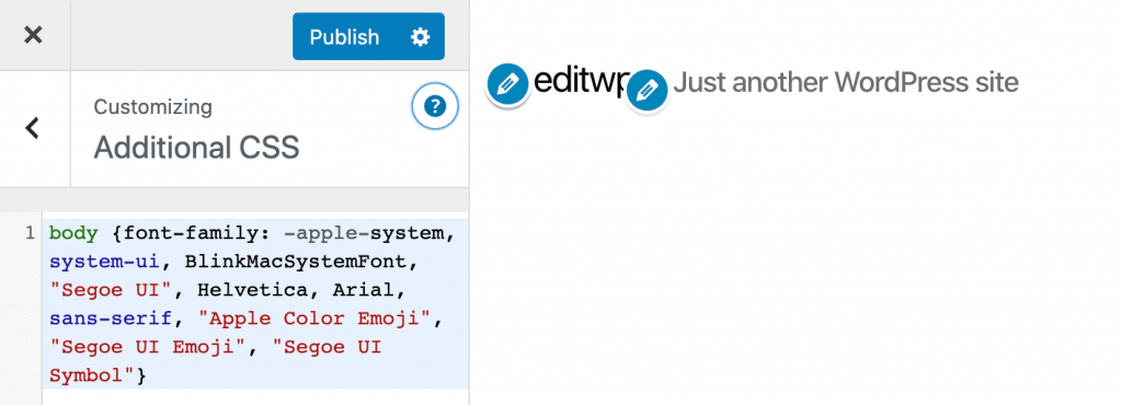
In WordPress, you’ll need to change the CSS on your font-family. You can use the WordPress customizer to add the code, under “Additional CSS.”

Step 2
Enter the following code. This might vary per theme, but for most, the following should override everything. I’m using the same system font stack as GithHub, except I’m adding system-ui as newer versions of Chrome support that. Remember, they will be used in the order they appear in the stack.
body {font-family: -apple-system, system-ui, BlinkMacSystemFont, "Segoe UI", Helvetica, Arial, sans-serif, "Apple Color Emoji", "Segoe UI Emoji", "Segoe UI Symbol";}
h1,h2,h3,h4,h5,h6 {font-family:-apple-system, system-ui, BlinkMacSystemFont, "Segoe UI", Helvetica, Arial, sans-serif, "Apple Color Emoji", "Segoe UI Emoji", "Segoe UI Symbol";}
Depending on your theme, you might need to add paragraph tags for the body content. So it would be this:
body, p {font-family: -apple-system, system-ui, BlinkMacSystemFont, "Segoe UI", Helvetica, Arial, sans-serif, "Apple Color Emoji", "Segoe UI Emoji", "Segoe UI Symbol";}
Step 3
You will also want to disable any 3rd party fonts, such as Google Fonts, that you have loaded from your WordPress theme. This again can vary, as each developer includes fonts differently. But many themes now have an easy way to toggle Google Fonts on or off.
If you use one of the default WordPress themes, you can easily use the free Disable Google Fonts plugin. Or you can also disable Google fonts in our Perfmatters plugin.
Before and after speed tests
And, of course, I couldn’t resist. Here are before and after speed tests. Each test was run five times, and an average was taken.
Speed test before
Here is the speed test before, when I had Google fonts loading.

Speed test after
Here is the speed test after using my system font stack. As you can see, I dropped my entire page weight by about 60 KB and got rid of three requests. One to fonts.googleapis.com and then two downloads for different font-weight versions of Roboto. The system font stack was about 6% faster than using Google fonts.

I know a lot of sites that use 4-5 different font weights or styles, and sometimes even 2-3 different Google fonts. So you could potentially see even more significant improvements than even I did.
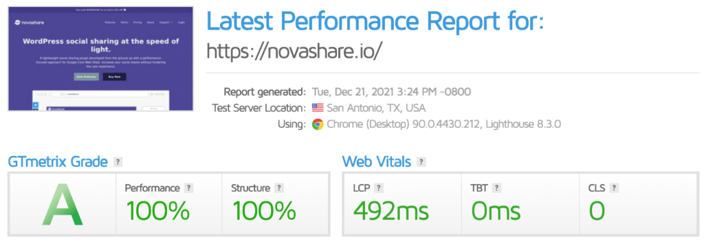
I also moved our novashare.io WordPress site to system fonts and had great results; check out this speed test below.

Font smoothing
Font smoothing comes down to personal preference. When you apply antialiasing, your font will be a little thinner and lighter. I’m not using it on this site as I prefer the slightly thicker font; I think it feels a little warmer. But you can experiment with both to see which one you like.
You can add this to the body.
body {
-webkit-font-smoothing: antialiased;
-moz-osx-font-smoothing: grayscale;
}
Summary
System fonts can be a great alternative to web fonts and web-safe fonts. I still really like the look of my font, and now I know it’s not causing any load for users. Even though Google fonts can be hosted locally, it’s still part of the overall page weight.
Curious what your thoughts are? Have you used a system font stack yet with WordPress? If so, let me know below.
It’s awesome, but I don’t think Adobe’s Typekit website is not going to use system fonts any time soon. 😉
It makes me wonder… is the advocation of system fonts in 2017 really going to push through with majority of websites running on system fonts.
Or are we in fact spreading the news that ‘Speed is Key’? And as majority of the web move to HTTP/2 we can scurry back to a Typographer’s dream — a Font Synergy Web?
Haha, ya system fonts goes against everything that Adobe Typekit is :)
It really depends. To be honest, a well-optimized site won’t notice too much difference if you just change the fonts. But add everything up and it can speed your site up.
HTTP/2 is awesome for parallelism, multiplexing, PUSH, etc… which definitely makes it easier in 2017 to speed up both 3rd party fonts and those you host yourself. But I couldn’t resist going with system fonts. It is just plain fast!
It’s not fast, it’s *omnipresent*⚡️
First of all thanks for this Awesome Post Brian :-)
I have some Questions regarding this post
1 – This method Work on All Browsers?
2 – It will Display the Font According to Device and Browsers?
3 – For System Font’s CSS Implementation Method is Enough?
Thanks, Santhosh.
1. Yes, this will work on all browsers. But you have to think of it more along the lines of operating systems, not just browsers. The list above is what I am using.
2. Correct
3. Yes, no fonts are required as they are already on the OS for each platform. All you need is the CSS :)
do we have to download fonts or something? or just CSS is enough I am confused lol :p
Hey Garry! It’s just CSS. The system fonts are already on the operating systems. No download of fonts required :) That is the beauty of it!
But after that I can not change the size or color of the text.
You would just need to change the font color or size with CSS.
Ok, thanks.
I am also using mythemeshop
Let me ask how do you get rid of the scroll effect and the color of your post when you move the mouse over?
I have to use css to adjust color and font size, but I have to use “! Important” to be able to apply. Do you have a solution for me?
You can either directly edit MyThemeShop’s style sheet or you will have to use !important to override their styles.
Brian nice tip – performance addicts like myself say thanks !
But doesn’t that mean you’d need to proof and test your site and it’s layout in every system/OSes to ensure they look right too ?
Hey George,
Technically yes, but I haven’t seen any major issues across all platforms.
I’m about to switch to system fonts and was curious if you ever ran into any problems (even super minor ones) while using them that caused you to switch back to a web font?
Or was it entirely just a personal design preference?
Thanks for a great post, by the way.
Hey Jeff! No problems at all, just caught my eye on a certain font I couldn’t resist :) I’ve probably switched back and forth a dozen times now haha. But no problems with running a system font stack. It’s by far the fastest method out there. Go for it!
Hi Brian,
I took your advice and switched to system fonts. Fonts connected via theme settings.
It may not be so beautiful, but the site is faster and with fewer requests.
Thanks for the advice!
I wish you good luck and success!
Hey Sergey! Yes, system fonts are a great way to help speed up your site. Glad you were able to make the switch.
Hello Brian,
What font did you currently use?
My text looks different with system font.
Hey Stefan,
I currently use system fonts on all of my WordPress sites. Are you sure you are implementing it correctly? Also, what OS are you on? It will look slightly different on macOS vs Windows due to the system font they have available. You might want to also check to see if your font is using what is called font-smoothing or not. See here: https://woorkup.com/system-font/#font-smoothing
Hi Brian
I have managed to get the title tags to work but cant get the body to change still showing Raleway. I have used !important but cant get it as you have on https://wpcoupons.io/
My website is buckspartyvenues.com.au
Thanks for the article.
Daniel
Hey Daniel. Depending on your theme, you might need to add the paragraph tags as well. So it would be this:
body, p {font-family: -apple-system, system-ui, BlinkMacSystemFont, "Segoe UI", Helvetica, Arial, sans-serif, "Apple Color Emoji", "Segoe UI Emoji", "Segoe UI Symbol";}Wonderful write up.
Can you advise in step 2 of (Option 2: Add system font stack with CSS) where to add the code in function or stylesheet
Amit
Hey Amit,
Yes, in the WordPress Customizer, simply drop it into the Additional CSS section.
Hey, does this also work with Elementor and the Hello Theme? If so do I need to change the CSS in the Child or Parent Theme?
Hey Sebastian,
You should be able to use system fonts with any theme, including page builders like Elementor. First, you’ll most likely need to add Elementor’s filter to disable Google Fonts. You can find this in their docs. Then add the CSS for system fonts. For a child theme, you’ll probably need to add the CSS to the child site’s CSS.
Many thanks for this. Apart from my GeneratePress premium site looking better and loading super fast, using system fonts has eliminated a CLS problem I’ve been battling with for weeks.
Hey Tom,
Glad to hear it! System fonts are awesome for performance and usability.
I know this is an old post … but it’s freakin’ awesome! Just implemented system fonts for all sites and it was super-easy with GeneratePress. So happy with the results. Thank you!
Glad it was helpful! +1 for GeneratePress.
This is a very good alternative. Now my speed for the mobile version on PageSpeed Insights = 97-99. I use the system fonts rule for mobile devices only.
Added rule to CCS Wordpress
@media only screen and (max-width: 578px) {
body {font-family: -apple-system, system-ui, BlinkMacSystemFont, “Segoe UI”, Helvetica, Arial, sans-serif, “Apple Color Emoji”, “Segoe UI Emoji”, “Segoe UI Symbol”;}
}
Very helpful article!
But I would like a similar serif system font stack, since yours is all sans-serif.
Hey Thomas,
You could definitely do the same thing with serif system stack. Something like this would work:
Or you can use any serif system font order that you want.